我刚开始掌握Flutter的窍门,但我不知道如何设置按钮的启用状态。
从文档中,它说将onPressed设置为null来禁用按钮,并给它一个值来启用它。如果按钮在生命周期中继续处于相同的状态,这是没问题的。
我得到的印象是,我需要创建一个自定义的有状态小部件,它将允许我以某种方式更新按钮的启用状态(或onPressed回调)。
我的问题是我该怎么做?这似乎是一个非常简单的要求,但我在文档中找不到任何关于如何做到这一点的东西。
谢谢。
我刚开始掌握Flutter的窍门,但我不知道如何设置按钮的启用状态。
从文档中,它说将onPressed设置为null来禁用按钮,并给它一个值来启用它。如果按钮在生命周期中继续处于相同的状态,这是没问题的。
我得到的印象是,我需要创建一个自定义的有状态小部件,它将允许我以某种方式更新按钮的启用状态(或onPressed回调)。
我的问题是我该怎么做?这似乎是一个非常简单的要求,但我在文档中找不到任何关于如何做到这一点的东西。
谢谢。
当前回答
如果你正在寻找一种快速的方法,而不关心让用户在一个按钮上点击多次。你也可以这样做:
// Constant whether button is clicked
bool isClicked = false;
然后在onPressed()函数中检查用户是否已经单击了按钮。
onPressed: () async {
    if (!isClicked) {
       isClicked = true;
       // await Your normal function
    } else {
       Toast.show(
          "You click already on this button", context,
          duration: Toast.LENGTH_LONG, gravity: Toast.BOTTOM);
    }
}
其他回答
你也可以设置空白条件,在设置null的地方
         var isDisable=true;


          RaisedButton(
              padding: const EdgeInsets.all(20),
              textColor: Colors.white,
              color: Colors.green,
              onPressed:  isDisable
                  ? () => (){} : myClickingData(),
              child: Text('Button'),
            )
对于特定且数量有限的小部件,将它们包装在小部件IgnorePointer中正是这样做的:当它的忽略属性被设置为true时,子小部件(实际上是整个子树)是不可点击的。
IgnorePointer(
    ignoring: true, // or false
    child: RaisedButton(
        onPressed: _logInWithFacebook,
        child: Text("Facebook sign-in"),
        ),
),
否则,如果您打算禁用整个子树,请查看AbsorbPointer()。
这是在Flutter中禁用按钮的最简单的方法是将空值分配给onPressed
ElevatedButton(
  style: ElevatedButton.styleFrom(
    primary: Colors.blue, // background
    onPrimary: Colors.white, // foreground
  ),
  onPressed: null,
  child: Text('ElevatedButton'),
),
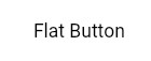
为了禁用任何按钮,如FlatButton, RaisedButton, MaterialButton, IconButton等,你需要做的就是将onPressed和onLongPress属性设置为null。下面是一些按钮的简单示例:
FlatButton (Enabled)
FlatButton(
  onPressed: (){},
  onLongPress: null, // Set one as NOT null is enough to enable the button
  textColor: Colors.black,
  disabledColor: Colors.orange,
  disabledTextColor: Colors.white,
  child: Text('Flat Button'),
),
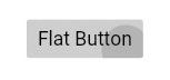
FlatButton(禁用)
FlatButton(
  onPressed: null,
  onLongPress: null,
  textColor: Colors.black,
  disabledColor: Colors.orange,
  disabledTextColor: Colors.white,
  child: Text('Flat Button'),
),
RaisedButton(启用)
RaisedButton(
  onPressed: (){},
  onLongPress: null, // Set one as NOT null is enough to enable the button
  // For when the button is enabled
  color: Colors.lightBlueAccent,
  textColor: Colors.black,
  splashColor: Colors.blue,
  elevation: 8.0,

  // For when the button is disabled
  disabledTextColor: Colors.white,
  disabledColor: Colors.orange,
  disabledElevation: 0.0,

  child: Text('Raised Button'),
),
RaisedButton(禁用)
RaisedButton(
  onPressed: null,
  onLongPress: null,
  // For when the button is enabled
  color: Colors.lightBlueAccent,
  textColor: Colors.black,
  splashColor: Colors.blue,
  elevation: 8.0,

  // For when the button is disabled
  disabledTextColor: Colors.white,
  disabledColor: Colors.orange,
  disabledElevation: 0.0,

  child: Text('Raised Button'),
),
IconButton (Enabled)
IconButton(
  onPressed: () {},
  icon: Icon(Icons.card_giftcard_rounded),
  color: Colors.lightBlueAccent,

  disabledColor: Colors.orange,
),
IconButton(禁用)
IconButton(
  onPressed: null,
  icon: Icon(Icons.card_giftcard_rounded),
  color: Colors.lightBlueAccent,

  disabledColor: Colors.orange,
),
注意:一些按钮,如IconButton只有onPressed属性。
有两种方法:
1- https://stackoverflow.com/a/49354576/5499531
2-你可以使用MaterialStatesController:
final _statesController = MaterialStatesController();
然后将状态更改为:
_statesController.update(
   MaterialState.disabled,
   true, // or false depending on your logic
);
在你的按钮上
ElevatedButton(
    onPressed: _onPressed,
    statesController: _statesController,
    child: Text("Awesome"),
),
此外,你可以改变按钮的风格,当禁用: 在主题设置中:
....
elevatedButtonTheme: ElevatedButtonThemeData(
              style: ElevatedButton.styleFrom(
                backgroundColor: colors.primary500, // set your own color
                textStyle: button, // set your own style
                onPrimary: colors.onPrimary100, // set your own color
                enableFeedback: true,
                disabledBackgroundColor: colors.primary300, // set your own color
                disabledForegroundColor: colors.primary300, // set your own color
                disabledMouseCursor: SystemMouseCursors.forbidden, // when is disable the change the cursor type
              ),
            ),
...
